Creative Description
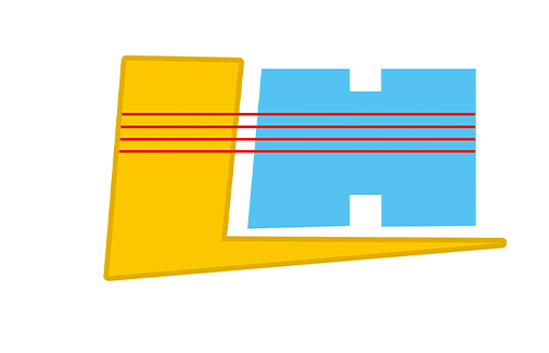
The graphic is the artistic effect of the first letter "LH" of "LongHe". The graphic consists of three parts: L fully highlights the meaning of the cargo fork and represents the logistics field; H reflects the field of construction machinery and symbolizes the development of Longhe Company and the Great Wall of the China .The red lines respectively represent the four fast channels for the rapid development of the four fields of forklift, construction machinery , agricultural machinery and automobile equipment involved by the enterprise.
Figure L with golden color represents the quality of gold; H is for harmony, wide as the sea; The red line is full of passion and good luck, symbolizing the prosperity of the enterprise. The overall combination of graphics into a Chinese character "jin" and "world", on behalf of the company in the development of the road to progress, and integration with the world, expressed the dragon and heaven and earth and integration of the whole world, the world is a family of good wishes.

 Company Profile
 Workshop and Equipment
 VR full view
 Brand Story
 Certification
 Corporate Culture
 News
News